
Category Components
Components for category listing pages - product grids, filtering, toolbars, and category-specific features.
Component Slots
Category Domain
| Slot | Description |
|---|---|
grid | Product grid layout |
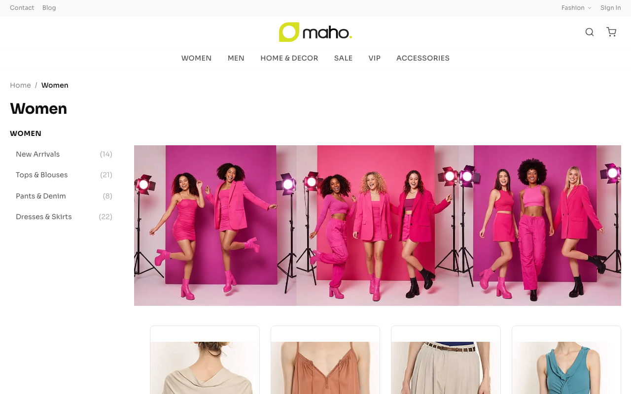
hero | Category hero banner |
toolbar | Sort + view options bar |
banner-inline | Promotional banner between product rows |
subcategory-tiles | Visual subcategory navigation tiles |
Filtering Domain
| Slot | Description |
|---|---|
sidebar | Filter sidebar panel |
price-range | Dual-thumb price range slider |
sort-select | Sort order dropdown |
pagination | Page navigation controls |
chip-bar | Active filter chip display |
Grid Layout
The product grid is responsive with configurable columns per breakpoint:
json
{
  "pages": {
    "category": {
      "gridColumns": {
        "mobile": 2,
        "tablet": 3,
        "desktop": 4
      }
    }
  }
}
Grid columns are resolved via getGridColumns('category') and applied as CSS grid classes.
Filter Sidebar
The filter sidebar displays layered navigation attributes (color, size, brand, price range). On desktop it appears as a left sidebar; on mobile it slides in as an overlay.
Filter Types
| Type | UI | Example |
|---|---|---|
| Attribute | Checkbox list | Color: Red, Blue, Green |
| Price Range | Dual-thumb slider + inputs | $10 - $200 |
| Category | Linked list | Subcategory navigation |
URL-Based Filtering
Active filters are reflected in the URL query string, making filtered views:
- Bookmarkable
- Shareable
- Browser back/forward compatible
Category Hero
Optional hero banner at the top of category pages. Supports:
- Category image from Maho admin
- CMS block content overlay
- Custom HTML content
Toolbar
Top-of-grid toolbar with:
- Sort select - Price (low/high), Name (A-Z/Z-A), Newest
- Result count - "Showing 1-24 of 142 products"
- View toggle - Grid vs. list view (where both card variants exist)
Configuration
json
{
  "pages": {
    "category": {
      "components": {
        "card": "standard",
        "filter": "sidebar"
      },
      "gridColumns": {
        "mobile": 2,
        "tablet": 3,
        "desktop": 4
      }
    }
  }
}
Source: src/templates/components/category/, src/templates/components/filtering/